The Brief
Amen Ever was a collaborative live motion graphics project for Wessex Museums. They wished for us to depict the life of writer Thomas Hardy, reimagining what he would have experience and bringing to life some of his writing. The museum we were allocated was Wiltshire, as a consequence our animation had to relate to the sub-themes of the rural landscape and superstition.

Collaboration: Eve Sawyer, Harry Torode, Dan Prentice and Robert Pearce
The Mommet
After a storytelling workshop with Tim Laycock, it opened my eyes to the experiences and era in which Hardy lived. Expanding our contextual knowledge surrounding Hardy’s life enabled us to be much more analytical of his writing and to determine which extract our piece should focus upon. Unanimously we concluded upon ‘The Mommet’. Within the extract, it depicted prominently the supernatural theme and radiated visual depictions we could produce and the audio which would work accordingly.
To further my personal understanding of ‘The Mommet’ I conducted an analysis of the extract. Through doing so, it allowed me to establish some key audio elements which could be introduced and some prominent visuals which could be developed further. The key element found through my analysis was how we could use the ribbon either as a symbolic device for either: colour or as a tool to link the two themes of the landscape and supernatural together. After conducting a group discussion, we were able to start imaging the narrative of our animation and the ways in which we could target the two sub-themes from the brief.

Storyboards
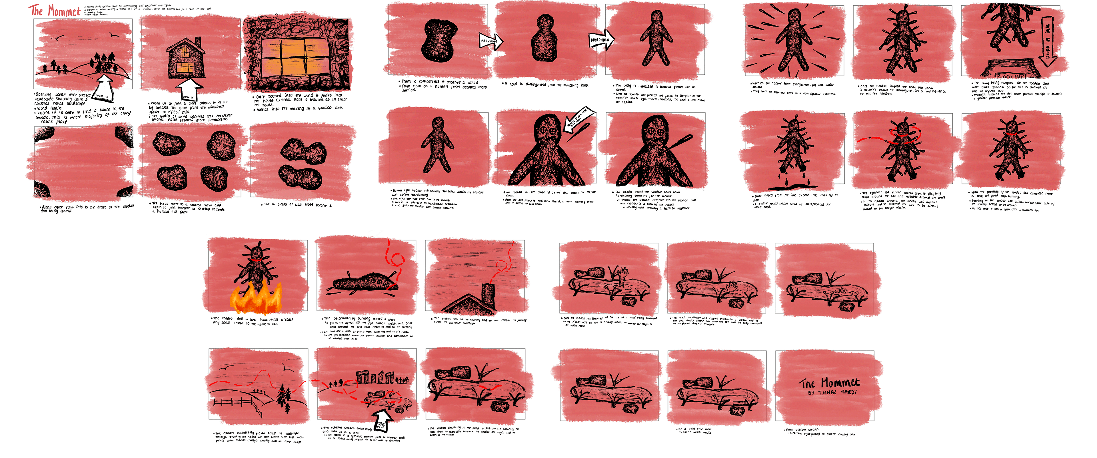
With a detailed understanding of Hardy’s work and surrounding research, our group started to sketch up a storyboard. Initially, we focused upon coming up with a few sketches which we could then build around and adapt to make our narrative.
The sketches allowed us to work out how we would be able to highlight both the landscape and supernatural elements. We concluded that the red ribbon will be a symbolic motif throughout the story and would act as the link between the landscape and the supernatural. The juxtaposition created through the contrast of calm and chaos heightens the supernatural frames and would build to a climax when reaching the fire.

Drawing Style
With the roles with the team and audio finalised, Dan and I started to consider the approach which we were going to have when drawing the animation. We decided to set a series of brushes, textures, and thicknesses which were allowed to use. Establishing these variables, I believe it enabled us to have a much more polished outcome, which would be hard to distinguish who drew what elements.

Typography
As the motion style became more refined, we concluded that the typography which we were going to introduce into our animation must be hand-drawn. With all components being drawn and having a very tactile quality, having a digital typeface would hinder the supernaturality that we were establishing. We all had a go at coming up with styles, trying to achieve a scratchy, eerie typography style that worked with the aesthetical qualities of the motion. Reflecting upon our experiments, we concluded that Robert’s typography will be the typography seen throughout the animation. Robert was able to produce some typography that not only had a scratching style but further a chaotic nature. The typography was a component of our animation that visually enhanced the supernatural presence.

Animatic
To understand the pace of the animation we produced an animatic. Not only did the animatic allow for us to pitch better to the clients about our vision but it also set a confirmed target for Dan and I. When combining our different drawings, it became very apparent how moving between my drawings and Dans some transitions were very harsh. The animatic allowed us to play with transitions between our differing scenes and to work out how the drawing would later be configurated.

Client Feedback
"The team really loved the atmosphere and eeriness of this one. (It was in fact so effective at this that we are looking at how to put an age rating on it, within the exhibition space!). It really linked the moody landscape to the sense of unease and foreboding in the human characters. I loved the link with the ribbon implying the cause and effect."