Brief
To build a web portfolio that demonstrates four core projects and to develop the student’s ability to work with HTML and CSS. They should have a functioning portfolio accessible to the industry and shall be predominantly used for the end-of-year networking event.
User Navigation Workshop
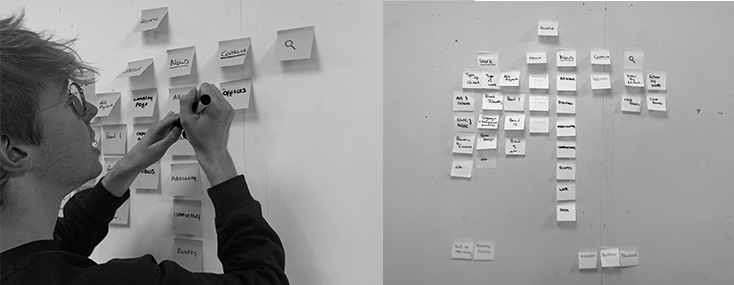
For us to be able to build a website we had to understand how they were configurated. To do this we analysed website structures, focusing upon the hierarchy of pages and user navigation. In the workshop, the task at hand was to pick an agency and to deconstruct their website to the skeletal level. In small groups we were allocated agencies, we looked into Pentagram. Through this activity, we quickly came to realise the complexity of their navigation and the many levels of pages that are embedded. Although this task seemed very simplistic, it allowed me to start the ball rolling on my project making me consider user navigation of my site.

Designing My Wireframe
The navigation workshop allowed me to consider page hierarchy to my website. Initially, I established the core components which were to go on my website, this enabled me to consider the content which would be depicted within. From this, I was able to develop a more refined wireframe that demonstrates the sub-pages from within some of the content. I utilised my GoodNotes on my iPad to configure my wireframe, this software allowed me to easily make adjustments to my flow and visually pointed out any discrepancies with the navigation. The final wireframe which I produce was the beating heart of my website, from this foundation I was able to build code surrounding the frame and construct the navigational flow to my site. With the wireframe flushed through, it enabled me to start blocking in my content.

Typography
Although I choose to move away from the analogue aesthetic for my website, I decided to keep the hand-drawn typeface. This allowed for me to imply my analogue practice which could later be reinforced through my example work. My work highlights my analogue approach and therefore I concluded that I didn’t need to make it prominent through the style of my site.
‘Post’ is the primary typeface used throughout my site. It is used for the text of highest importance and when key information is required to be viewed first. The typeface allowed me to build a hierarchy within my site especially when I introduced my pairing typeface Cabin. The introduction of the cabin font allowed me to build a stronger navigational site and the variable font attribute enabled me great flexibility. The two fonts work collaboratively to not only bring personality to my website but to also ensure legibility.

Colour Scheme
Moving away from my initial monochromatic colour palette, I refined my site down to the colour scheme below. The red colour is drawn from my Motion Graphics project and is utilised as the symbolic colour throughout. Having a restricted colour palette, I believe gives my site a more modern approach as my style and project work aren’t having to compete for centre stage.

URL Icon
With the majority of my site finalised it was time to tweak minor elements. With this said, I decided to add a URL icon to my site. Not only do I believe it produces a more polished appearance when viewing my site, but it also adds a subtle element of branding that would normally be overlooked. I decided upon my ES initials and I believe it turned out very effectively.
Testing on Different Devices
Understanding that my site is required to work on the variety of screen sizes now available, with my site complete, I conducted some tests. Ensuring that my website can move from a phone to an iPad, to Laptop and a Monitor enabled me to identify some technical discrepancies. Through this testing, I was able to iron out the coding mistakes and ensure that from whatever platform you view the site can work adaptively.
User Testing
Although I understood that I could navigate my site, some things as a designer you become so knowledgeable of what you have designed that when tested it’s difficult for others to understand. With this being said, I conducted some user testing. Testing it on a variety of people allowed me to clarify that the navigability of my site was indeed clear.