Brief
Hardy’s Wessex was a collaborative live branding project for Wessex Museums. They wished for us to brand their touring Thomas Hardy exhibition and produce a collection of merch. The exhibition was called ‘Thomas Hardy the landscape that inspired the writer’ and aimed to get the ages of 18-35 predominantly engaged. Wessex Museums wished to target a new age range demographic and believed people of that range designing for them would increase engagement.
Brand Strategy
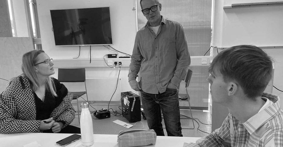
Ben Friend’s talk surrounding brand strategy allowed me to question why and what we desired to depict within our brand identity. Posing the question ‘Hardy’s Wessex the landscape that inspired the writer is an exhibition that…’ allowed us as a team to identify our soul message. As a team, we brainstormed many varying avenues of purposes but concluded upon ‘interrogating stereotypes.
"Hardy's Wessex The Landscape that inspired the writer is an exhibition that interrogates his stereotypes"

Concept
As a team taking this idea of interrogating stereotypes which, each individually drew up three different avenues. From this we each picked our strongest design to put forward to the Wessex Museums team. Of our four individual ideas, they choose that my design would be the one to be taken forward and developed.
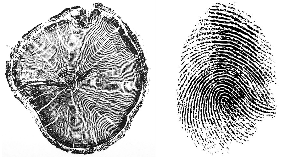
The concept which I pitched, focused upon drawing visual similarities from tree lifelines and fingerprints. I played with the textural qualities of fingerprints and tree lifelines but also the forms which can be found within. I used the textural qualities of fingerprints predominantly in the initial idea and applied it to imagery which could be further translated into merchandise.

Logo Development
The logo to our brand identity took a lot of refinement and iteration. We went from a fingerprint focus to a much more nature-focused stance, this was predominantly because the client desired for us to give the work a more landscape-focused feel. Our final mark is a close-up of a tree lifeline drawing that we made however due to the form of the graphic it still holds the correlation to the fingerprints.


Imagery
When initially faced with the imagery that Wessex Museums had provided us with, we quickly concluded that the quality of these images and style would be incredibly difficult to incorporate within our designs when trying to attract the target range of 18-30. We decided to make imagery as a solution to the problems we were encountering. The illustrations not only allowed us to draw prominent landmarks from Hardy’s writing but also through drawing style reinforce the tree lifeline concept.

Colour Palette
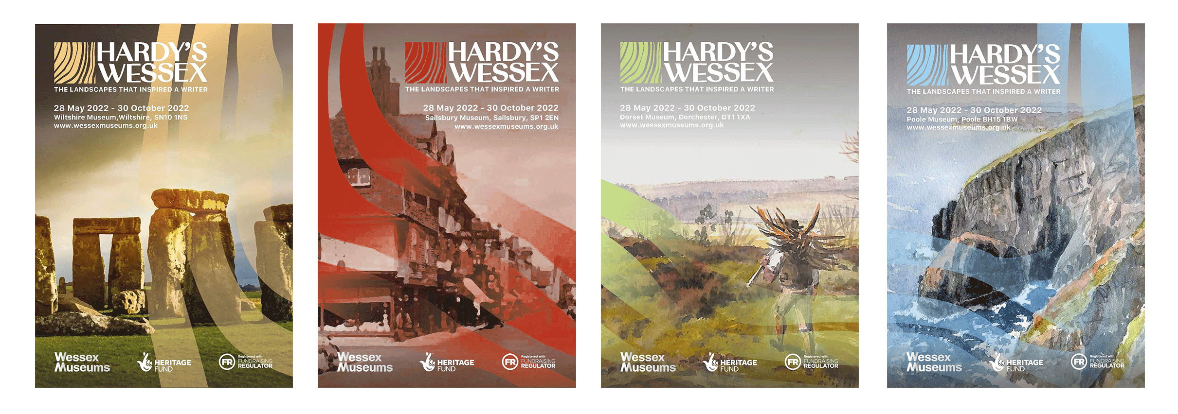
With the logo and core, imagery established it was now time to consider the colour palette. Wessex Museums are divided into four different sights and the exhibition which we are branding will be at all four. Although the same exhibition will be in each of the four museums, each museum has a sub-focus surrounding a part of Hardy’s life. For each museum, we designated a colour, not only did this allow for differentiation when branding each museum but also coordination to each sub-theme.

Posters
With our colour scheme established it was now time to design some touchpoints. Initially, we started with our lead poster. Our head poster consisted of Thomas Hardy himself and a subtle overlay of tree lifelines. This subtle reference to the rest of the brand identity allowed us to produce a cohesive brand image. We also designed a poster for each museum. Here you can see the colour scheme is applied and also the lifeline being used as a tool to interflow the different posters. When aligned in the correct order the posters have a continuous flow throughout allowing for the posters when all together to the unit to form a greater image.

Merchandise
Merchandise was something which Wessex Museums also required from the brand identity. We produced a variety of merchandise and we specifically focused upon ensuring that the items can be sold post-exhibition. As a team, we all decided that restricting the branding on the merchandise and letting the items speak for themselves would increase the life span of these items. This is something that Wessex Museums stressed heavily about as they did not want to have to waste any merchandise manufactured.
